Creating Dashboards
The SC Visualizer is part of the generic client suite of SocioCortex, and empowers end-users to visualize SocioCortex’s data. For this purpose, predefined visualization types (e.g., bar charts, etc.) can be bind to the SocioCortex data model in order to instantiate visualizations.
Let us consider the following exemplary data model representing a very simple enterprise architecture:
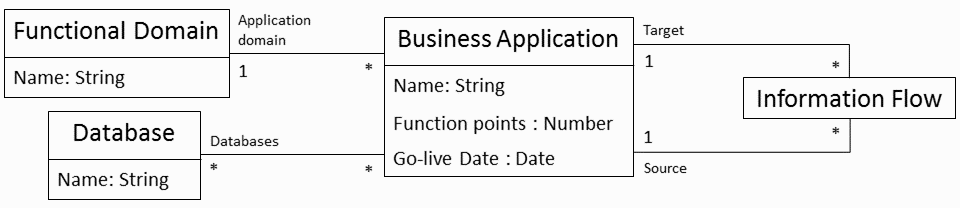
Based on this data model, one can instantiate visualization types in order to visualize certain aspects of the enterprise architecture.
Create Your First Dashboard
As a very first example, we just want to show the number of business application on a dashboard. For this purpose, log in to the SC Visualizer, navigate to the dashboards, and create the “NEW DASHBOARD” button on the top.
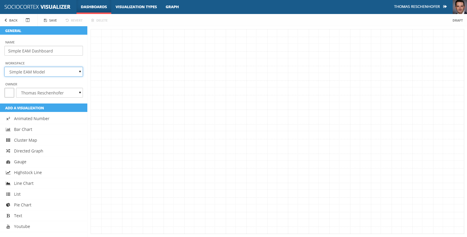
Initially, you will only see an empty dashboard grid. As a first step, just provide a meaningful name for your dashboard, choose a SocioCortex workspace which contains the data (model) you want to visualize. Furthermore, select an owner for the dashboard (this is by default you):
As a next step, click on the “Animated Number” visualization in the list of predefined visualization types in the left sidebar in order to add it to the dashboard grid. Afterwards, you can simply resize and remove the visualization:
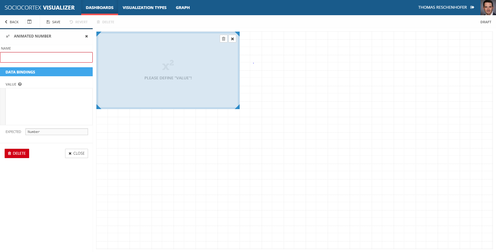
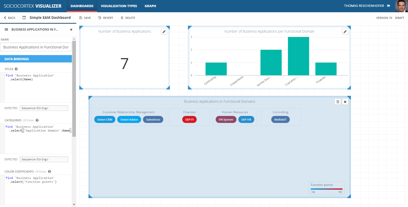
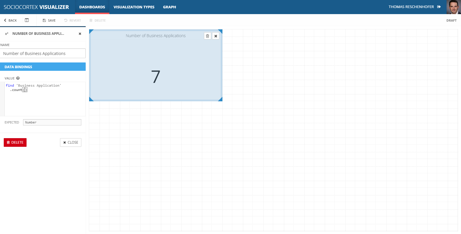
Each visualization has to be configured separately, whereas this configuration consists of a name (“Number of Business Applications”), and the definition of the binding to the data as well as of the visual settings (e.g., colors, etc.).
For the selected “Animated Number” visualization type, there is only one data binding to be defined, namely the value to be shown in the visualization, and no visual setting. As indicated by the “EXPECTED” field below the textarea for the data binding, the value has to be numerical.
At this stage, you have to transform the data of SocioCortex in a way that it fits to the data interface as defined by the visualization, i.e., in the example you have to somehow generate a number. Data transformations in SocioCortex are defined with MxL (learn more about MxL in the respective tutorial). Therefore, in order to show the number of business applications, we configure the “Animated Number” visualization with the expression find 'Business Application'.count():
To finish the configuration of the dashboard, click the “SAVE” button to confirm the changes, and the “BACK” button to close the edit-mode.
Extending Dashboards
Of course, you can create dashboards with more visualizations and more complex visualization types. If you have respective access rights, you can switch the dashboard to the edit-mode again by klicking the “EDIT” button on the top. Back in the edit-mode, you can simply add further visualizations from the left sidebar to the dashboard grid by clicking on them, and subsequently configuring them.
Let us add a “Bar Chart” visualization to show the number of business applications per functional domain. For this, choose the “Bar Chart”, and provide the following MxL expressions for its data bindings:
| Name | Expression | Description |
|---|---|---|
| Categories | find 'Functional Domain' .select(Name) |
Maps each functional domain to its name. For each item, the visualization creates a bar. |
| Values | [find 'Functional Domain' .select( get 'Business Application' whereis 'Application domain' .count())] |
Maps each functional domain to the number of its business applications (more information on the get whereis construct can be found here.). Each item of the numerical sequence refers to the corresponding item of the categories-sequence with the same index.Since the bar-chart can potentially show multiple bars, you could also provide multiple numerical sequences. In this case, we only have a single numberical sequence embraced by square brackets. |
| Labels | ["Functional Domains", "Number of Business Applications"] |
As documented in the description of this data binding parameter, the first string in this sequence refers to the label for the categories, whereas each further element represents the label for the corresponding numerical sequence. |
With the visual settings (which are also located in the sidebar below the data bindings), you can, e.g., switch the direction of the bars to “horizontal”. For this example, we stick with vertical bars. Consequently, the visualization should be as follows:
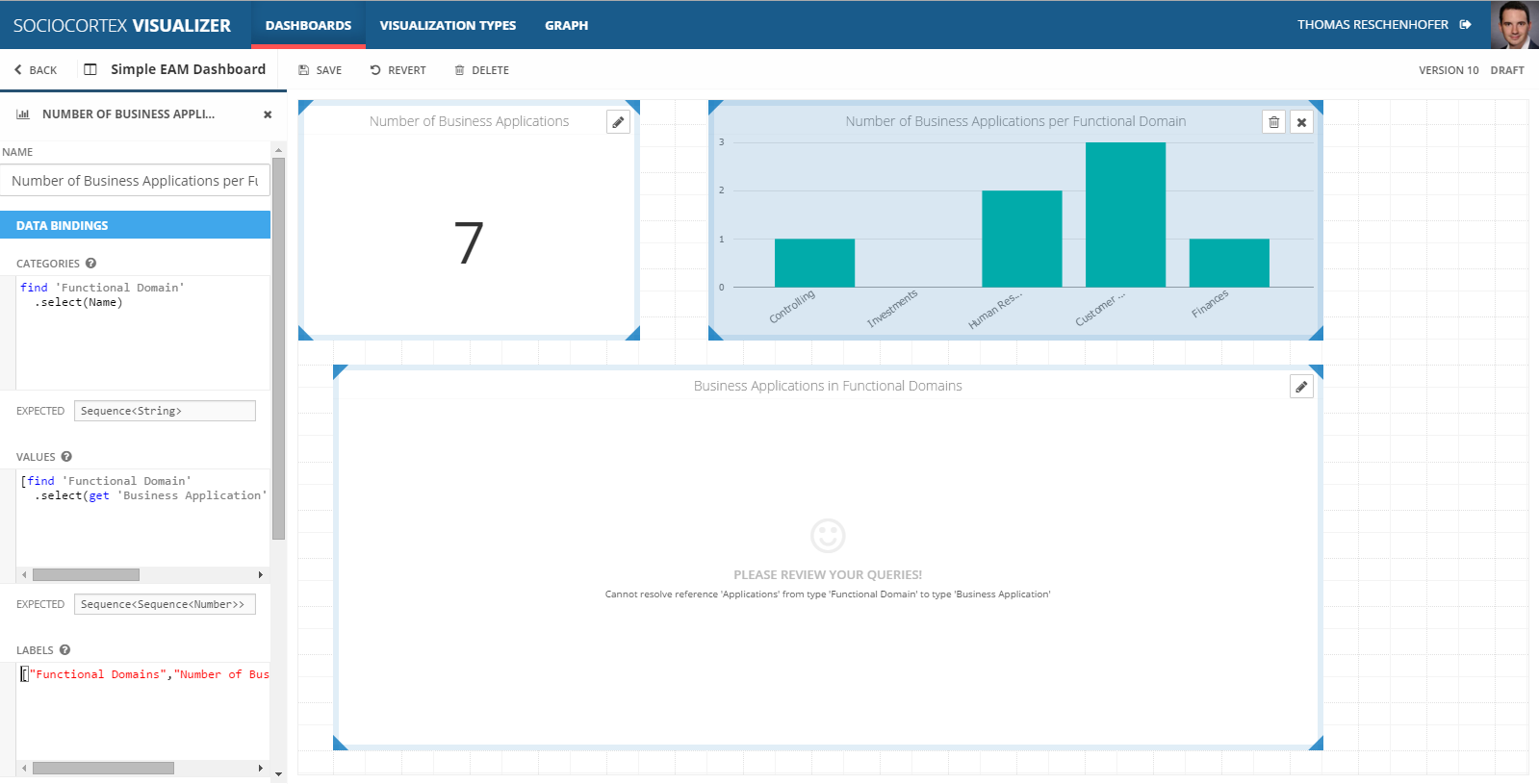
You can always edit the configuration of visualzations by clicking the “edit”-icon on the top right corner of each visualization. This will focus the respective visualization and make its configuration visible in the sidebar again. By clicking the “Deselct”-icon of a visualization, you can configure the dashboard itself, or add new visualizations to free areas of the dashboard grid. We can add a further visualization of type “Cluster Map” with the following configuration:
| Name | Expression | Description |
|---|---|---|
| Titles | find 'Business Application' .select(Name) |
Maps each business application to its name. For each item, the visualization creates one box. |
| Categories | find 'Business Application' .select('Application domain'.Name) |
Maps each business application to the name of the corresponding functional domain. For each distinct category name, the visualization generates a cluster and adds the corresponding items from the first parameter to it. |
| Color Coefficients | find 'Business Application' .select('Function points') |
Maps each business application to its function points. This number determines the color coding for each item of the first parameter. |
By defining the visual settings properly, the dashboard should finally look as follows: