Creating Visualization Types
The SC Visualizer comes with a basic set of predefined visualization types, e.g., bar chart, pie chart, or cluster map. However, this set of visualization types can be easily extended by new ones or adapted to the own requirements.
Properties of Visualization Types
Visualization types have the following types of properties:
- Basic (meta) properties include the visualization type’s name, owner, and icon.
- Data bindings define the data interface of the visualization types, i.e., which type of data can be consumed. In addition to the name, a data binding can also possess a restriction property defining the type of data parameter. For this, the SC Visualizer uses the MxL type notation (see here and here).
- Visual settings can be used to make visual properties of the visualization type configurable, e.g., colors, formats, etc.
- Implementation consists of an HTML template, CSS style declarations, and JavaScript code. The render-function is called by the SC Visualizer when instantiating the visualization, and passes the respective instantiated data bindings and visual settings as parameters.
Creating a Custom Visualization Type
Let us consider the following exemplary data model representing a very simple enterprise architecture, which was already introduced in the previous lesson:
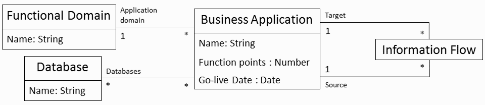
In this tutorial, we want to create a new general visualization type for visualizing a directed graph, which in the context of this example can be intantiated in dashboards to visualize business applications and their information flows.
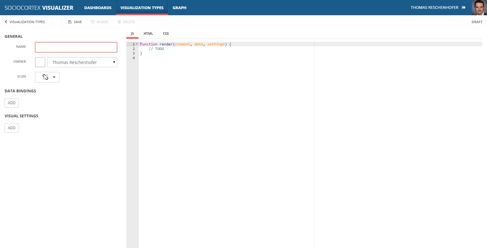
As a first step, navigate to “Visualization Types” in the top navigation bar of the SC Visualizer, and click the “NEW VISUALIZATION TYPE”-button.
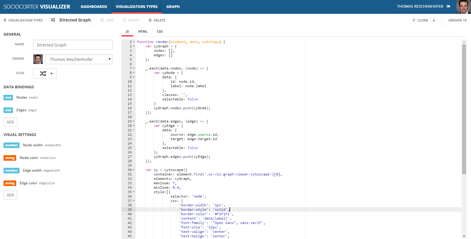
We name the new visualization type “Directed Graph”, and select a proper icon.
Definition of Data Binding Parameters
Next, we define the data binding parameters as follows:
| Name | Restriction | Description |
|---|---|---|
| Nodes | Sequence< Structure< id:String, label:String>> |
The nodes are defined by a sequence of complex objects, whereas each node has to have an (unique) ID and a label property. |
| Edges | Sequence< Structure< source:Structure< id:String>, target:Structure< id:String>>> |
The edges are defined by a sequence of complex objects, whereas each edge has a Source and a Target object. Those objects have to define IDs which refer to the IDs of the nodes. |
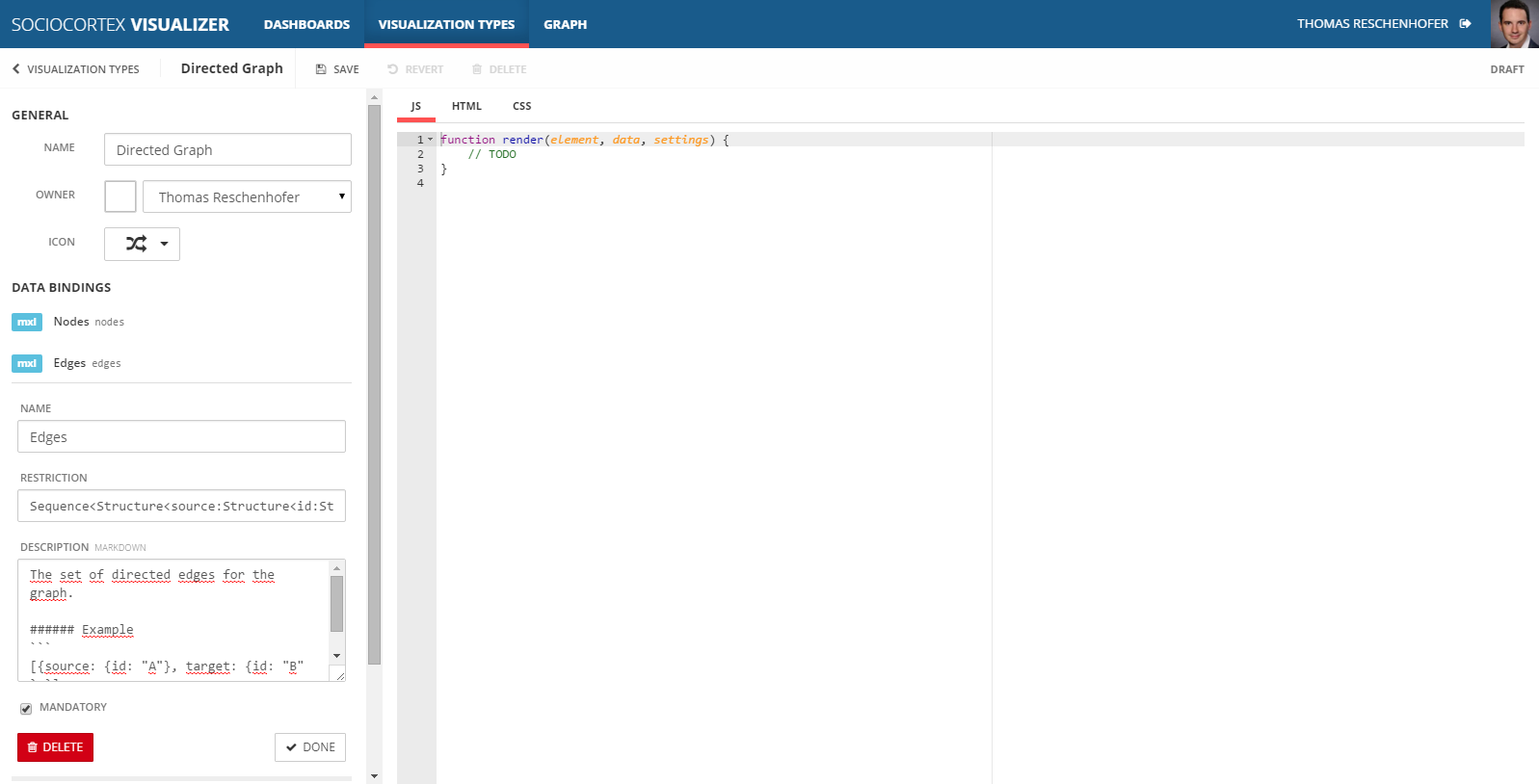
Later on, the data binding parameters are accessible in the visualization type’s implementation via the CamelCase-version of their names. In our example, the data-parameter of the render-function will have two properties nodes and edges with each containing an array of respective objects.
Definition of Visual Settings
In addition to the data binding parameters, we can define visual settings in order to make the visual appearance of the graph configurable by the users of the dashboard. For our example, we define the followin visual settings:
| Name | Type | Default value |
|---|---|---|
| Node width | Number | 100 |
| Node color | Color | #195B8B |
| Edge width | Number | 0.75 |
| Edge color | Color | #333333 |
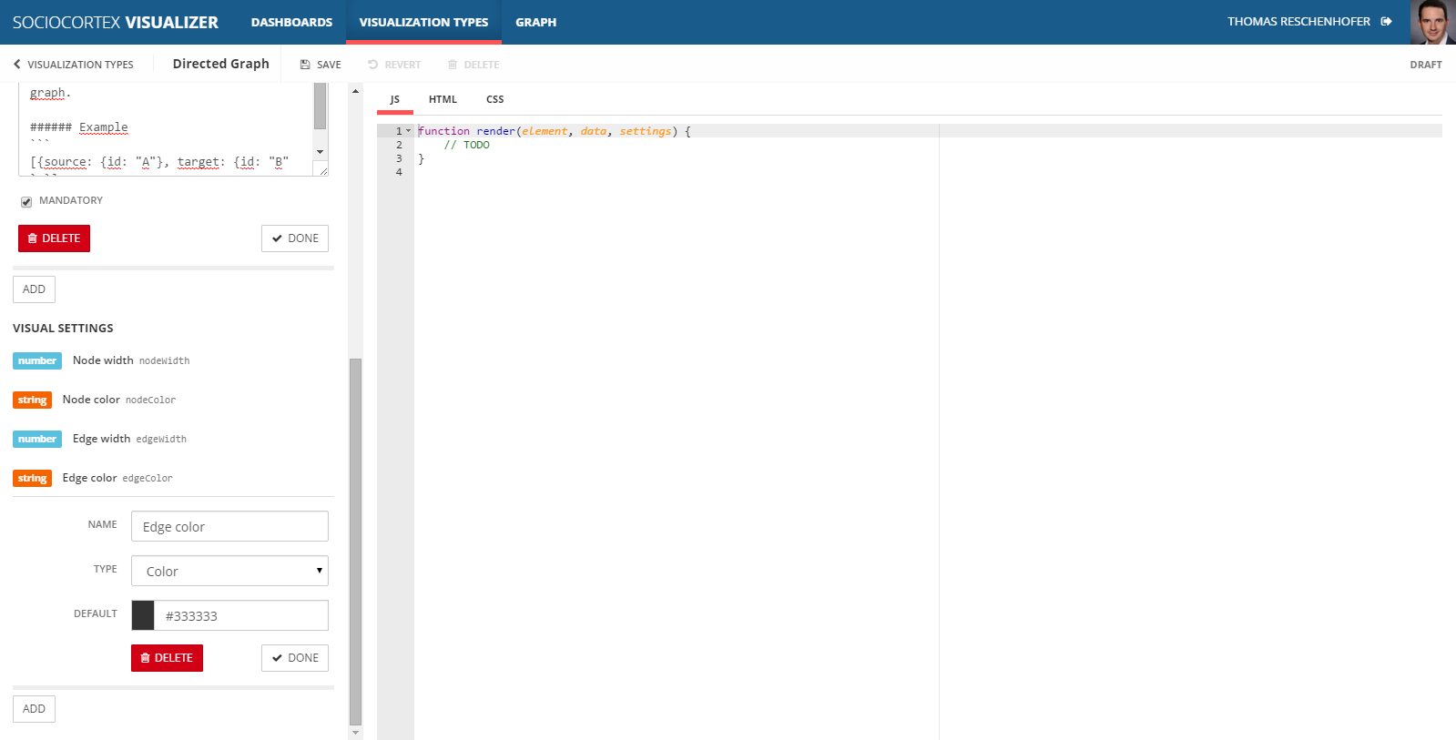
Analogously to the data binding parameters, visual settings are accessible in the visualization type’s implementation via the CamelCase-version of their names. In our example, the settings-parameter of the render-function will have four respective properties.
Implementation of the Visualization Type
While the data binding parameters and visual settings define the data and configuration interface of the visualization type, they are implemented by HTML, CSS, and JavaScript.
To generate a graph, we simply use a respective JavaScript framework, e.g., Cytoscape. The SC Visualizer also integrates other common JavaScript libraries by default, e.g., D3.js, Highcharts, or Power BI.
As a HTML template, we define two divs as containers for the generated graph view:
<div class="sc-viz-graph-viewer">
    <div class="sc-viz-graph-viewer-cytoscape sc-viz-dashboards-main">

    </div>
</div>
The CSS-section only contains the following style declaration:
.sc-viz-graph-viewer-cytoscape {
    position: absolute;
}
In the JS-section, we have to process the input parameters, and gernerate a corresponding graph as follows:
function render(element, data, settings) {
    var cyGraph = {
        nodes: [],
        edges: []
    };

    _.each(data.nodes, (node) => {
        var cyNode = {
            data: {
                id: node.id,
                label: node.label
            },
            classes: '',
            selectable: false
        }
        cyGraph.nodes.push(cyNode);
    });

    _.each(data.edges, (edge) => {
        var cyEdge = {
            data: {
                source: edge.source.id,
                target: edge.target.id
            },
            selectable: false
        };
        cyGraph.edges.push(cyEdge);
    });

    var cy = cytoscape({
        container: element.find('.sc-viz-graph-viewer-cytoscape')[0],
        elements: cyGraph,
        maxZoom: 7,
        minZoom: 0.4,
        style:[{
                selector: 'node',
                css: {
                    'border-width': '1px',
                    'border-style': 'solid',
                    'border-color': '#F1F1F1',
                    'content': 'data(label)',
                    'font-family': '"Open Sans", sans-serif',
                    'font-size': '12px',
                    'text-valign': 'center',
                    'text-halign': 'center',
                    'shape': 'rectangle',
                    'background-color': settings.nodeColor,
                    'color': 'white',
                    'width': settings.nodeWidth
                }
            },{
                selector: 'edge',
                css: {
                    'content': 'data(label)',
                    'width': settings.edgeWidth,
                    'target-arrow-shape': 'triangle-backcurve',
                    'transition-property': 'line-color',
                    'transition-duration': '0.66s',
                    'line-color': settings.edgeColor,
                    'target-arrow-color': settings.edgeColor,
                    'target-arrow-shape': 'triangle'
                }
            }]
    });
}
In the first part of the render-function, we transform the input parameters to a format which is compatible with the Cytoscape-graph framework. Thereby, the data-parameter provides us access to the nodes and edges which will be defined by users with respective MxL queries when instantiating the visualization.
In the second part of the render-function, the graph view is configured by passing nodes, edges, and visual settings as parameters to the cytoscape-function. Note that we use the values of the settings properties for the background-color and width of the node and the edge respectively.
The final visualization type should look as follows:
Note: This exemplary “Directed Graph” visualization type does not care about the layouting of the nodes.
Instantiating the Custom Visualization Type
When saving the new visualization type, it becomes available for all dashboards, i.e., it can be used as any other visualization type. For example, we can simply extend the exemplary dashboard of the previous tutorial.
For this, edit the a dashboard (e.g., “Simple EAM Dashboard”), and choose the “Directed Graph” visualization type from the left sidebar.
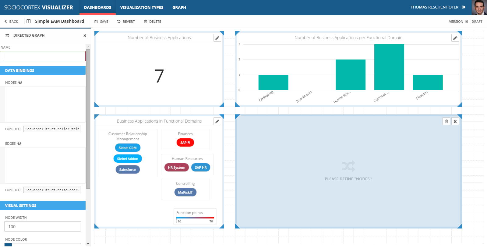
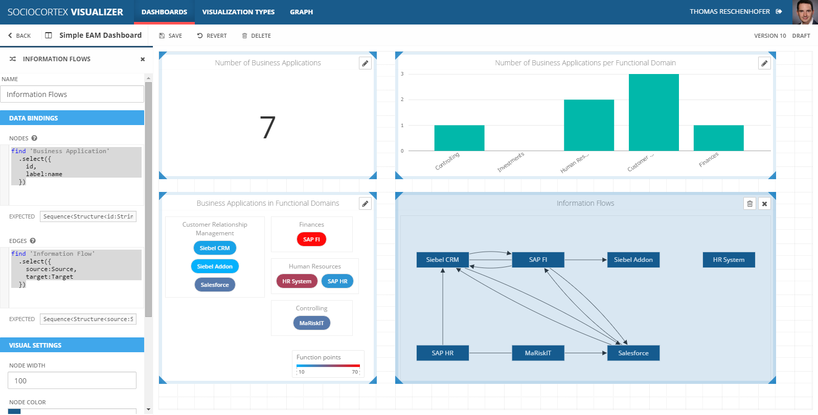
To visualize business applications and their information flows, we configure the data binding of the “Directed Graph” visualization as follows:
| Name | Expression | Description |
|---|---|---|
| Nodes | find 'Business Application' .select({ id, label:name}) |
Maps each business application to a node object. For the node ID, we simply map the id of the business application, while for the node label we use the name of the business application. More information on MxL queries can be found here. |
| Edges | find 'Information Flow' .select({ source:Source, target:Target}) |
Maps each information flow to an edge object. More information on MxL queries can be found here. |
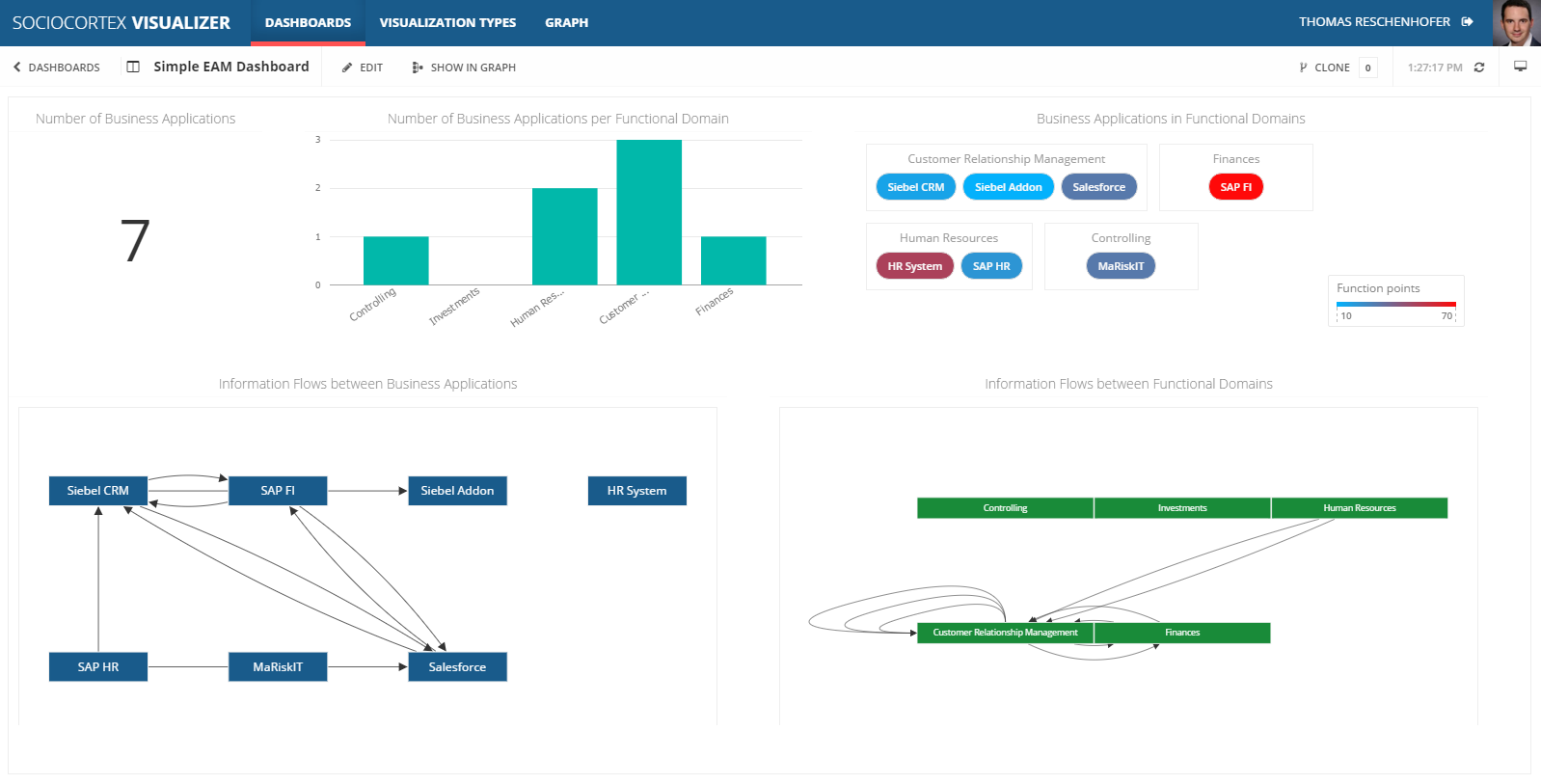
We do not change the visual settings, i.e., we stick to the default values, whereas the dashboard should not look as follows:
You can use the same visualizationt type to, e.g., visualize information flows between functional domains by simply adapting the data bindings:
| Name | Expression | Description |
|---|---|---|
| Nodes | find 'Functional Domain' .select({ id, label:name}) |
Maps each functional domain to a node object. For the node ID, we simply map the id of the functional domain, while for the node label we use the name of the functional domain. More information on MxL queries can be found here. |
| Edges | find 'Functional Domain' .selectMany(fd => fd.get 'Business Application' whereis 'Application Domain' .selectMany(get 'Information Flow' whereis Source) .select(Target.'Application Domain') .select(t => { source: fd, target: t})) |
In our case, an information flow between two functional domains is defined through the information flow between business applications between of those domains. Therefore, we define an edge from a functional domain A to a functional domain B, if there is an application X in A and an application Y in B as well as an information flow from X to Y. |
The final dashboard looks like follows:
The expression for the edges is already very complex. However, on the one hand this demonstrates that you can also define very complex data transformations and bind arbitrary data to the available visualization types. On the other hand, with some experience and the support of the MxL code editor, one will be able to define this kind of expressions very soon…